
Showing posts with label experimentation. Show all posts
Showing posts with label experimentation. Show all posts
Wednesday, January 12, 2011
Monday, January 10, 2011
We now resume our scheduled programming...
I hadn't realized just how long it had been since I had posted anything here - sorry about that. The end of last year was very hectic and stressful and kept me from working on very much 'fun' art. Things are looking up on many fronts though, including a new job.
I've been getting adjusted to working on a Cintiq art tablet, which is kind of like a giant iPad, so I've been messing around with it during lunch trying to get my bearing. Nothing spectacular, just some quick doodles, including this one:

Not much to look at yet, but hopefully, I can keep plugging away on this one - I think its got some potential.
Wednesday, August 25, 2010

Sunday, May 9, 2010
Acrylic Fever
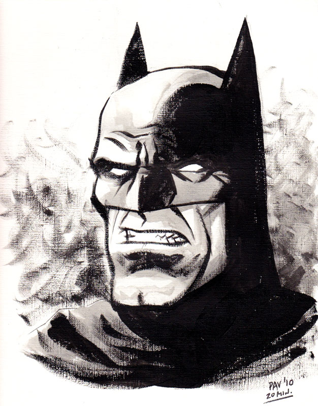
I'm still getting over the bad case of the flu I've had for the last week, but I did manage to get out for a bit this weekend and pick up some acrylic paints. Although I enjoy oils, I've been wanting to try acrylics, especially since they dry so much faster. I didn't have a lot of time or energy to do much with them, but I managed to get in a quick 20 minute sketch just using black almost like ink wash. I can't wait until I have the time to do some full blown painting with them.

Tuesday, March 16, 2010
POW! Right in the Kisser
I was messing around with some oil sketching on 9x12 canvas paper over the weekend - this took about 2 hours total:

Here's the photo I used as reference:

The proportions are all out of whack, but I had fun keeping it loose and simple.

Here's the photo I used as reference:

The proportions are all out of whack, but I had fun keeping it loose and simple.
Monday, March 1, 2010
Who Dat Ninja?
Things have been busy, but I'm still working on the writing side of my western story and I'm still trying to knock out some pages based on some odds & ends bits of writing I have lying around in the mean time.
I'm working on another 2 page story that came about after reading a post on Digital Webbing that was looking for short stories for an anthology book. All of the stories had to have something to do with ninjas. I thought it would be fun to do something a little more historically based than the usual fantasy based ninja stories. I never heard anything from the guys putting the book together beyond the initial contact, so I shelved the story until now.
Being such a short story, it's pretty straight forward so I wanted to have some fun with the visual style. I love Kurosawa's samurai films and have always admired the sumi brush drawing style of traditional Japanese art so I'm trying to combine the two styles. I'm hoping it'll be a little looser, more expressive and moodier that my usual stuff. We'll see. Here's the first panel:

Monday, December 14, 2009
A Bold Experiment
Two of the artists I work with had the idea of trading drawings that are unfinished for one reason or another and seeing what somebody else could do with it. We made the first exchange last week and here's what I came up with:
The original sketch by Cef Grima:


I was trying to emulate the way that Dave Stewart has been coloring the Umbrella Academy books. I like the way it looks and I wanted to see if I could figure out how he does it.
It was fun to work on, and I'm looking forward to the next one.
**UPDATE**
Eric Huang posted his interpretation of my chicken scratches up on his blog. I think he did a great job on it - it's a nice blend of his style and mine. He's going to have to show me how he got that aged look on the colors.
The ball is in your court now, Cef! BRANG IT AWN!!!
The original sketch by Cef Grima:

The finished piece:

I was trying to emulate the way that Dave Stewart has been coloring the Umbrella Academy books. I like the way it looks and I wanted to see if I could figure out how he does it.
It was fun to work on, and I'm looking forward to the next one.
**UPDATE**
Eric Huang posted his interpretation of my chicken scratches up on his blog. I think he did a great job on it - it's a nice blend of his style and mine. He's going to have to show me how he got that aged look on the colors.
The ball is in your court now, Cef! BRANG IT AWN!!!
Thursday, October 8, 2009
Logo Loco
I'm working on some logo ideas for one of the stories I'm trying to get off the ground. It's a western called "Badge" (the first page is done and will be posted later this week) and it's very much influenced by a lot of the classic western films. There have been some other western comics that have come out in the last few years, but a lot of them are either very modern feeling stories with a lot of graphic language and violence or they are "westerns plus", i.e. westerns + horror, westerns + scifi. I don't have a problem with either approach, I just thought I'd try some thing different, something more old fashioned.
A lot of old movies (not just westerns) had really great hand painted titles, like these examples:

Lettering is not really my thing, so my results in trying to get that look are mixed, but here's some raw lettering that came out OK (by raw I mean that I haven't done any aging or outlining or anything):

I'd like to avoid using any sort of stereotypical western fonts, but I found a few that had a nice feel without looking like the Purina Chuck Wagon logo:

I've also messed around with the idea of replacing the A with an actual sheriff's badge, but that might be too cutesy:

No final decisions yet, but as the art for the story starts to develop, all of this other stuff will fall into place.
A lot of old movies (not just westerns) had really great hand painted titles, like these examples:

Lettering is not really my thing, so my results in trying to get that look are mixed, but here's some raw lettering that came out OK (by raw I mean that I haven't done any aging or outlining or anything):
I'd like to avoid using any sort of stereotypical western fonts, but I found a few that had a nice feel without looking like the Purina Chuck Wagon logo:

I've also messed around with the idea of replacing the A with an actual sheriff's badge, but that might be too cutesy:
No final decisions yet, but as the art for the story starts to develop, all of this other stuff will fall into place.
Sunday, September 13, 2009
What Evil Lurks in the Hearts of Men?
Only The Shadow knows! (insert Orson Welles laughter here)
Messing around with markers & white Prismacolor pencil on textured grey paper:

Messing around with markers & white Prismacolor pencil on textured grey paper:

Thursday, July 30, 2009
Burnin' Ring of Fire
Another experiment - this time marker & Prismacolor on brown paper bag and then a bunch of Photoshoppery:

Tuesday, July 28, 2009
What's Old is New Again
Here's a quick sketch I did to experiment with style & texture. I drew it with pens and a black Prismacolor pencil on canvas paper so that I could get the graininess of the paper to show up. I added the zip-a-tone look and spatters in Photoshop and then laid down some flat colors to finish it up:
 This closeup shows the texture a little bit better:

My inspiration to try out these new (to me) techniques came from several sources. I was looking at some movie posters from the '50s when they started using more graphic styles (like this poster for Vera Cruz), also some of the illustrators of the same era who were experimenting with looser rendering techniques (like Mitchell Hooks here), as well as a contemporary comic book artist named Dave Johnson who uses a lot of these same inspirations & techniques but gets a very modern feel out of his work (like this cover for 100 Bullets).
For as little time as I put into it, I like the results, though I need to see if something like this would work on sequential pages. It might be too abstract to look at page after page.
Saturday, February 21, 2009
Technique Study
I got tired of working on my story outline, so I messed around with some techniques I've been thinking about for doing the backgrounds. Again, just throwing stuff at the wall to see what sticks:

Not the most ambitious example, but hopefully tomorrow I can find the time to try something a little more involved.

Not the most ambitious example, but hopefully tomorrow I can find the time to try something a little more involved.
Wednesday, January 14, 2009
Getting Back Into the Swing of Things
I've been busy/distracted lately, and whatever free time I've had has been spent working on/learning about writing, so I haven't had much to post. I am trying to get back into regular sketching though.
Here's a quick study from a movie still, just messing around with basic Photoshop brushes and working with a limited palette. Not the best likeness - it looks more like Robert Redford than Roger Moore. About 45 minutes of work:

Here's a quick study from a movie still, just messing around with basic Photoshop brushes and working with a limited palette. Not the best likeness - it looks more like Robert Redford than Roger Moore. About 45 minutes of work:

Subscribe to:
Posts (Atom)
