
Friday, December 18, 2009
Monday, December 14, 2009
A Bold Experiment
Two of the artists I work with had the idea of trading drawings that are unfinished for one reason or another and seeing what somebody else could do with it. We made the first exchange last week and here's what I came up with:
The original sketch by Cef Grima:


I was trying to emulate the way that Dave Stewart has been coloring the Umbrella Academy books. I like the way it looks and I wanted to see if I could figure out how he does it.
It was fun to work on, and I'm looking forward to the next one.
**UPDATE**
Eric Huang posted his interpretation of my chicken scratches up on his blog. I think he did a great job on it - it's a nice blend of his style and mine. He's going to have to show me how he got that aged look on the colors.
The ball is in your court now, Cef! BRANG IT AWN!!!
The original sketch by Cef Grima:

The finished piece:

I was trying to emulate the way that Dave Stewart has been coloring the Umbrella Academy books. I like the way it looks and I wanted to see if I could figure out how he does it.
It was fun to work on, and I'm looking forward to the next one.
**UPDATE**
Eric Huang posted his interpretation of my chicken scratches up on his blog. I think he did a great job on it - it's a nice blend of his style and mine. He's going to have to show me how he got that aged look on the colors.
The ball is in your court now, Cef! BRANG IT AWN!!!
Sunday, December 6, 2009

Tuesday, November 24, 2009
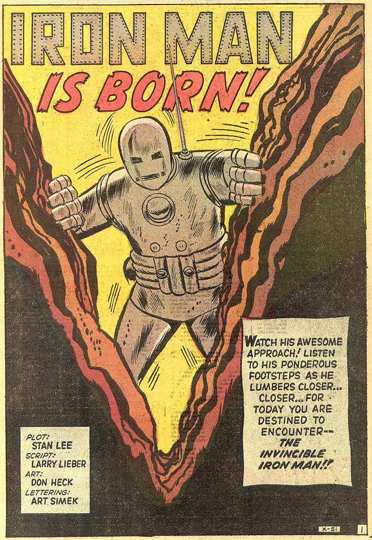
Iron Man Wants Cake
In the spirit of the DIY craft show my wife & I went to last weekend, I made this birthday card for a friend of mine (names have been obscured to protect the innocent):

It's a re-creation of the splash page from the very first Iron Man story back in 1963 - only fitting for the world's biggest Iron Man fan.
Monday, November 16, 2009

Friday, November 6, 2009
Drink & Draw

Sunday, November 1, 2009


Friday, October 30, 2009
Happy Halloween!
I managed to squeeze in a little sketch during lunch yesterday so that I could actually post something new for Halloween. I haven't drawn in my poor man's Mike Mignola style in a long time, so it was fun to tap into that for a bit:

Have a horrifically happy Halloween and don't eat too much candy!

Have a horrifically happy Halloween and don't eat too much candy!
Wednesday, October 28, 2009
Monster Mash-up
Some more Halloweeny stuff from the archives:

Who would win in a fight between Frankenstein and the Werewolf? I don't know, but I'd pay to see the fight. Poor Dracula didn't even make it past the first round.

Who would win in a fight between Frankenstein and the Werewolf? I don't know, but I'd pay to see the fight. Poor Dracula didn't even make it past the first round.
Tuesday, October 27, 2009
Halloween Countdown
I usually like to do some special posts for Halloween, but this year I'm very busy - there's a lot going on at work and the second page of Badge is behind schedule but almost done. Luckily, I've got some stuff in the archives that hasn't been posted yet, so I'm going to run that stuff this week:


Tuesday, October 20, 2009
"Call it my woman's intuition."
This past weekend I got to see the newly restored version of North by Northwest that was shown as part of the Chicago Film Festival. The new print was made for the Blu Ray release of the movie and Martin Landau was at the screening and answered some questions afterwards (the title of this post is a quote from his character in the film).
I always enjoy seeing old movies in the theater, especially anything from a master like Hitchcock. It's amazing how modern the movie feels. The opening credits were designed by Saul Bass, one of the graphic design pioneers who helped create what we think of as modern style. In fact, the opening credits to Mad Men (my favorite TV show after the Venture Bros.) are inspired by the credits in North by Northwest. I was inspired to try my hand at that clean design style and whipped this up during lunch:

Graphic design isn't really my strong suit, but it was fun to try play around in that style.
Thursday, October 8, 2009
BADGE - page 1
Alright, here's page one of "Badge", my western story. The plan is to post pages as I finish them, with no set schedule. Once I have a decent number of pages done to act as a buffer, I'll create a site for the strip and make it a proper web comic. Right now, I'm just trying to get into a production groove, see if the story has any legs, and to get some feedback (good or bad):

I'm producing the pages at full print resolution in the event that the story ever goes to print. Here's a full rez shot of panel three as an example:

I thought I'd go over my process (which is still evolving), in case there's any interest. I'm working from a loose outline which should honestly be tighter than it is, but I want to get this story rolling before I find more excuses not to do it. I'm drawing thumbnails for each page at about 2"x3", scanning them in, then printing them out at 6"x9" and penciling over that:

The finished art is all done in Photoshop to save time and to allow for more experimentation. The goal is to build up several simple techniques to get an illustrative look in a relatively short amount of time. The first step is the inking, which is primarily focused on form and laying in the graphical black elements. I want the story to have a bit of a rough edge, so I created a brush that gives me a look similar to black Prismacolor pencil on textured paper:

Next, I go in an lay in some medium greys, mostly flat with a few gradients:

After that, I go back in with a brush I made that has an ink wash feel to it to give the page some extra texture and tonal value:

One all that is in, I go back and do a polishing pass with digital screens (like the old zip-a-tone patterns that old comics used) for more tone and texture, some digital spatter (which I used to do with an old toothbrush back in the day), and finally, just going in and punching out some white highlights on things:

After the lettering is done, I overlay a scan of old parchment paper to give everything an antiqued look and I'm pretty much done. It sounds like a lot, but really, I'm just building up several simple steps that add up to (I hope) a lush, finished look.
When I post the second page, I'll re-post page one without all of the blabbing.
Thanks for taking a look. Like I said, any comments, good or bad, are appreciated.
I'm producing the pages at full print resolution in the event that the story ever goes to print. Here's a full rez shot of panel three as an example:
I thought I'd go over my process (which is still evolving), in case there's any interest. I'm working from a loose outline which should honestly be tighter than it is, but I want to get this story rolling before I find more excuses not to do it. I'm drawing thumbnails for each page at about 2"x3", scanning them in, then printing them out at 6"x9" and penciling over that:
The finished art is all done in Photoshop to save time and to allow for more experimentation. The goal is to build up several simple techniques to get an illustrative look in a relatively short amount of time. The first step is the inking, which is primarily focused on form and laying in the graphical black elements. I want the story to have a bit of a rough edge, so I created a brush that gives me a look similar to black Prismacolor pencil on textured paper:
Next, I go in an lay in some medium greys, mostly flat with a few gradients:
After that, I go back in with a brush I made that has an ink wash feel to it to give the page some extra texture and tonal value:
One all that is in, I go back and do a polishing pass with digital screens (like the old zip-a-tone patterns that old comics used) for more tone and texture, some digital spatter (which I used to do with an old toothbrush back in the day), and finally, just going in and punching out some white highlights on things:
After the lettering is done, I overlay a scan of old parchment paper to give everything an antiqued look and I'm pretty much done. It sounds like a lot, but really, I'm just building up several simple steps that add up to (I hope) a lush, finished look.
When I post the second page, I'll re-post page one without all of the blabbing.
Thanks for taking a look. Like I said, any comments, good or bad, are appreciated.
Logo Loco
I'm working on some logo ideas for one of the stories I'm trying to get off the ground. It's a western called "Badge" (the first page is done and will be posted later this week) and it's very much influenced by a lot of the classic western films. There have been some other western comics that have come out in the last few years, but a lot of them are either very modern feeling stories with a lot of graphic language and violence or they are "westerns plus", i.e. westerns + horror, westerns + scifi. I don't have a problem with either approach, I just thought I'd try some thing different, something more old fashioned.
A lot of old movies (not just westerns) had really great hand painted titles, like these examples:

Lettering is not really my thing, so my results in trying to get that look are mixed, but here's some raw lettering that came out OK (by raw I mean that I haven't done any aging or outlining or anything):

I'd like to avoid using any sort of stereotypical western fonts, but I found a few that had a nice feel without looking like the Purina Chuck Wagon logo:

I've also messed around with the idea of replacing the A with an actual sheriff's badge, but that might be too cutesy:

No final decisions yet, but as the art for the story starts to develop, all of this other stuff will fall into place.
A lot of old movies (not just westerns) had really great hand painted titles, like these examples:

Lettering is not really my thing, so my results in trying to get that look are mixed, but here's some raw lettering that came out OK (by raw I mean that I haven't done any aging or outlining or anything):
I'd like to avoid using any sort of stereotypical western fonts, but I found a few that had a nice feel without looking like the Purina Chuck Wagon logo:

I've also messed around with the idea of replacing the A with an actual sheriff's badge, but that might be too cutesy:
No final decisions yet, but as the art for the story starts to develop, all of this other stuff will fall into place.
Friday, October 2, 2009
Funny but true
I realized I haven't posted anything in a while which is ironic since I've been very busy with a lot of different art projects. One of which is this Fear Agent pin-up I've been chipping away at during lunch. I wasn't going to post it until I inked it, but what the Don Heck.
A few weeks ago I was at the 2nd annual Windy City ComicCon and went out to dinner with a group that included Tony Moore, artist on lots of cool stuff but probably best known for his work on Fear Agent with writer Rick Remender. I've always liked Fear Agent - it's right up my retro alley - but I had never drawn Heath Huston or anything else from it, so that's where this sketch comes in:

A few weeks ago I was at the 2nd annual Windy City ComicCon and went out to dinner with a group that included Tony Moore, artist on lots of cool stuff but probably best known for his work on Fear Agent with writer Rick Remender. I've always liked Fear Agent - it's right up my retro alley - but I had never drawn Heath Huston or anything else from it, so that's where this sketch comes in:

Monday, September 21, 2009
One Reel Wonders
I found out from a friend that the owner of a local night club is an avid fan of old and obscure films, and once a month he shows some of the movies in his collection at the club. My wife and I went last week and saw two one reel zingers - The Preview Murder Mystery & Strangler of the Swamp. Both films were favorites of film historian William K. Everson, who helped preserve lots of these non-mainstream films. Both movies had very cool visuals despite their shoestring budgets and packed a lot of story into an hour or less, but I enjoyed the Strangler the most, just because it felt like a story that might have been in an E.C. comic back in the day.
I'd been wanting to draw something based on it and I finally had some time today during lunch to knock this out:

I'd been wanting to draw something based on it and I finally had some time today during lunch to knock this out:

Thursday, September 17, 2009
Out with the Old, In with the New
The company I work for was recently bought by Disney and today is officially our first day under the Mouse. I would imagine that we'll have to say goodbye to some of our old characters that aren't quite family friendly, like Stubbs the Zombie:

I guess that just means that we'll have to come up with something even better.

I guess that just means that we'll have to come up with something even better.
Sunday, September 13, 2009
What Evil Lurks in the Hearts of Men?
Only The Shadow knows! (insert Orson Welles laughter here)
Messing around with markers & white Prismacolor pencil on textured grey paper:

Messing around with markers & white Prismacolor pencil on textured grey paper:

Saturday, August 29, 2009
Long Live the King!
I read that yesterday would have been Jack 'The King' Kirby's 93rd birthday if he hadn't already gone off to Valhalla to hang out with Thor and the Warriors Three:


Sunday, August 23, 2009
Odds & Ends
I didn't really come up with anything worth posting at last week's Drink n' Draw, so I thought I'd post a few other things I've worked on this summer.
Way back when I was first getting my start as an artist - probably around 1994 - I drew an illustration for the cover of a novel called Alligator Alley, which you can still get on Amazon. It's a fun neo-noir kind of crime story written by Ken Coffman and Mark Bothum. They were very cool to work with and generous in giving a greenhorn like me a chance to do some work for them. Out of the blue, Ken got in touch with me earlier this year about helping him out with some new projects he was working on, and I was glad to help him out. Ken is not only publishing his own books, but is also starting up imprints to help other writers get their work in print, which is impressive since he does all of this in his free time.
The main character from Alligator Alley is a guy named Glen Wilson. Glen is a sort of slippery anti-hero of questionable morals who bears more than a slight resemblance to James Woods. He's gone on to further adventures in other books, so Ken asked if I could draw him a B&W logo for the books that could be used in a frontispiece to tie them all together. He suggested a variation on the skull & crossbones with Glen's head in place of the skull. I thought that was a cool idea so we ran with that:

Ken has another book coming out this fall called Hartz String Theory and he asked me to design some logos for the two mysterious shadow organizations in the story. Not to give anything away, but the first group is a sort of ancient Illuminati type group, so I gave them an old fashioned engraved looking logo made up of the arcane symbols Ken said were important to them:

The second group is more of a street level militant band of anarchists, so I wanted to given them a DIY looking logo that could be stenciled onto walls with spray paint:

I'm not really a graphic designer, so it was a fun challenge and a nice change of pace to work on these.
Way back when I was first getting my start as an artist - probably around 1994 - I drew an illustration for the cover of a novel called Alligator Alley, which you can still get on Amazon. It's a fun neo-noir kind of crime story written by Ken Coffman and Mark Bothum. They were very cool to work with and generous in giving a greenhorn like me a chance to do some work for them. Out of the blue, Ken got in touch with me earlier this year about helping him out with some new projects he was working on, and I was glad to help him out. Ken is not only publishing his own books, but is also starting up imprints to help other writers get their work in print, which is impressive since he does all of this in his free time.
The main character from Alligator Alley is a guy named Glen Wilson. Glen is a sort of slippery anti-hero of questionable morals who bears more than a slight resemblance to James Woods. He's gone on to further adventures in other books, so Ken asked if I could draw him a B&W logo for the books that could be used in a frontispiece to tie them all together. He suggested a variation on the skull & crossbones with Glen's head in place of the skull. I thought that was a cool idea so we ran with that:

Ken has another book coming out this fall called Hartz String Theory and he asked me to design some logos for the two mysterious shadow organizations in the story. Not to give anything away, but the first group is a sort of ancient Illuminati type group, so I gave them an old fashioned engraved looking logo made up of the arcane symbols Ken said were important to them:
The second group is more of a street level militant band of anarchists, so I wanted to given them a DIY looking logo that could be stenciled onto walls with spray paint:
I'm not really a graphic designer, so it was a fun challenge and a nice change of pace to work on these.
Wednesday, August 12, 2009
Drink & Draw
Last night I went to a Drink & Draw session with some of the comic book artists that live in Chicago. It was a great group of guys and everyone made me feel very welcome. Hopefully, I can make it a regular thing.
I was lucky enough to sit next to talented artist and all around nice guy Hilary Barta who offered to ink what I was doodling. I wish had come up with something better, but Hilary made it look great anyway despite working in an environment totally unsuited to inking. Here's the Flash Gordon sketch we teamed up on:

I was lucky enough to sit next to talented artist and all around nice guy Hilary Barta who offered to ink what I was doodling. I wish had come up with something better, but Hilary made it look great anyway despite working in an environment totally unsuited to inking. Here's the Flash Gordon sketch we teamed up on:

Tuesday, August 4, 2009
Thursday, July 30, 2009
Burnin' Ring of Fire
Another experiment - this time marker & Prismacolor on brown paper bag and then a bunch of Photoshoppery:

Wednesday, July 29, 2009

Tuesday, July 28, 2009
What's Old is New Again
Here's a quick sketch I did to experiment with style & texture. I drew it with pens and a black Prismacolor pencil on canvas paper so that I could get the graininess of the paper to show up. I added the zip-a-tone look and spatters in Photoshop and then laid down some flat colors to finish it up:
 This closeup shows the texture a little bit better:

My inspiration to try out these new (to me) techniques came from several sources. I was looking at some movie posters from the '50s when they started using more graphic styles (like this poster for Vera Cruz), also some of the illustrators of the same era who were experimenting with looser rendering techniques (like Mitchell Hooks here), as well as a contemporary comic book artist named Dave Johnson who uses a lot of these same inspirations & techniques but gets a very modern feel out of his work (like this cover for 100 Bullets).
For as little time as I put into it, I like the results, though I need to see if something like this would work on sequential pages. It might be too abstract to look at page after page.
Friday, June 19, 2009
Jack London in Paradise
I take the train to work everyday and I use that time to make up for years of not reading by plowing through as many books as I can.
Right now, I'm reading "Jack London in Paradise" by Paul Malmont. His first book, "The Chinatown Death Cloud Peril", is one of my favorites. He seems to enjoy taking his favorite writers and dropping them into the types of stories that they wrote. I'm sure it's been done before, but I really enjoy his approach to it.
I never knew much about Jack London before starting this book, so I've been reading a bit about him and looking at old photos online. I gave myself 15 minutes to knock out a sketch of him and another 15 minutes to 'antique' it a bit:

Friday, June 12, 2009
Pulp in Progress
I'm slowly chipping away at inking the group sketch of pulp characters I posted a few days ago so I thought I'd post a little work in progress detail of the Spider, the Shadow and most of Doc Savage's widow's peak. I know that Doc wasn't portrayed that way until James Bama started painting the covers to the reprints in the 60's, but that's the way he'll always look to me:


Wednesday, June 10, 2009
I Love a Mystery
I get tired of listening to music while I work, so I've started listening to some of the old time radio shows. The internet archive has a huge collection, but some of the files are in such bad shape they aren't worth listening to. Fortunately, there is an OTR fanatic who runs a site called Broken Sea Audio and one of the things he does is restore old shows so that they can be enjoyed again.
Lately, I've been listening to a show called 'I Love a Mystery' which is more of an adventure show than a mystery show done in a very pulpy style. The serials have great titles like 'Temple of Vampires' and 'Pirate Loot of the Island of Skulls'. The thing I realize as I listen to these shows is that maybe radio dramas were the ideal format for pulp stories. I've tried reading some of the old books and while I love the concepts, I can't get into the writing. Same goes for the movies, even the modern ones like Sky Captain - nice visuals, but not quite right (though The Rocketeer was great, as was the Rocketeer comic book). These radio shows somehow hit the marks that the books and movies miss. I suppose it has something to do with the concept of the 'Theater of the Mind' as they used to say in the golden age of radio.
Anyway, I was inspired to make a fake vintage newspaper ad for the show:

One interesting thing about these old shows is the advertising. This show was sponsored by Fleischmann's yeast which wasn't being advertised as a baking ingredient, but as a health food. You either mixed it into tomato juice to make a 'vitamin cocktail' or just ate it straight - blech!
Wednesday, June 3, 2009
Backlog
After putting in a lot of hours to finish a big project at work, then taking a short but much needed vacation, and finally slogging through the inevitable post-vacation slump I'm getting back to being productive again.
I spent most of last weekend cleaning my home studio and in the process found a pile of old, half finished artwork. Since they're all pretty far along and won't require any major effort, I'm going to try to finish them up and hopefully build up momentum towards some of the other, bigger efforts I'm trying to get off the ground.
Up first is a sketch I drew when I was reading a lot about the history of the pulps - just a goofy group shot of some of the major and minor characters of the era:

I'm going to clean it up, ink it and probably color it too. I'll post the steps as I go. I also need to go back and figure out who all the characters are - there are some pretty obscure ones in there.
Tuesday, May 19, 2009
Artchives 3
I've been putting in a lot of hours on a project for work, but I'm in the home stretch - just in time for my wife & I to go visit some friends over the long holiday weekend. Here's one last batch of old miscellany before I try to get back to a normal schedule.
These first three were for a story that I tried to get off the ground for a long time, but got away from me. Maybe someday I can go back to it with fresh eyes:


This one was for a pitch someone was putting together for a horror themed multimedia site, this character was going to be the host, in a simlar vein to Svengooli (get it? vein? horror?):

These last three were character designs for a video game about mobsters in space:


Friday, May 8, 2009
Artchives 2
The game I worked on for most of the last year is coming out on May 14th. It's called Texas Cheat'em - a poker game where cheating is not only allowed, it's the only way to win.
It was a very different project than what I had been used to, but it was a lot of fun. As the only artist on the game, I was responsible for every pixel you see on screen. The game has a lot of interface, so I did a lot more graphic design work than usual. I also got to do a lot more cartooning than I've ever done before on the player avatars. Here are some of my favorites:


Some of the avatars are specific to certain cheats (like the burglar=chip steal) or to certain mini-games (like the strongman=strength tester), but most are just meant to be funny. Also, creating these was where I learned digital inking since it was going to speed up my production time quite a bit, so some of the early ones are a bit rougher than the later ones.
Early on, we were planning out a story mode where you would play through a character's career as a gambler from rags to riches. At that point, we were toying with the idea of using animals as the characters and since our company mascot is a hippo, the main character was going to be a hippo. Here are some storyboards I did to try to get a feel for what all that could have been like:


Ultimately, it was decided that it would have been too much work for too little added value, so it got scrapped but we had some good ideas that would have been pretty fun to work on.
Subscribe to:
Posts (Atom)
