
Showing posts with label lord bastard. Show all posts
Showing posts with label lord bastard. Show all posts
Wednesday, August 25, 2010
Saturday, March 21, 2009
Zeppelin Fight
I've had a very hectic couple of weeks, so I haven't done a lot of work on the Lord Bastard project. That's not to say that I haven't been thinking about it a lot - I'm finally to a point with the story and characters where I can see things playing out like a movie in my mind. The characters are coming to life and the whole thing is starting to have its own 'feel'. On paper, I'm behind where I want to be with the project, but I feel good about where it's going.
I took some time last night to loosely concept an idea for a scene I've been kicking around:


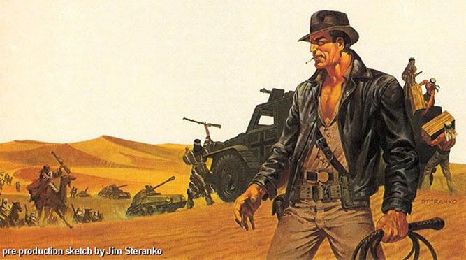
One of my most cherished possessions is an old copy of Prevue magazine from the late 70's that had a big pull out poster of concept art that Jim Steranko did for Raiders of the Lost Ark. I love the rugged feeling he gave the paintings and the warm tones he used to give the desert a romantic, pulpy feel. This is my lame attempt at capturing that same feeling.
I took some time last night to loosely concept an idea for a scene I've been kicking around:


One of my most cherished possessions is an old copy of Prevue magazine from the late 70's that had a big pull out poster of concept art that Jim Steranko did for Raiders of the Lost Ark. I love the rugged feeling he gave the paintings and the warm tones he used to give the desert a romantic, pulpy feel. This is my lame attempt at capturing that same feeling.
Wednesday, February 25, 2009
Another Study
Another quick concept piece to try out some things.
I realized that I've never posted anything that takes place after the first act of the story, which is when things really get going. Although there's a definite John Carter influence to it, Bastard doesn't end up on Mars. I was going for kind of a Spaghetti Western sunset and went a little nuts with the red:

I realized that I've never posted anything that takes place after the first act of the story, which is when things really get going. Although there's a definite John Carter influence to it, Bastard doesn't end up on Mars. I was going for kind of a Spaghetti Western sunset and went a little nuts with the red:

Saturday, February 21, 2009
Technique Study
I got tired of working on my story outline, so I messed around with some techniques I've been thinking about for doing the backgrounds. Again, just throwing stuff at the wall to see what sticks:

Not the most ambitious example, but hopefully tomorrow I can find the time to try something a little more involved.

Not the most ambitious example, but hopefully tomorrow I can find the time to try something a little more involved.
Monday, February 16, 2009
Pre-pre-production
Having just wrapped up the game I've been working on, I was able to have a long weekend off and managed to get a lot done on what I call pre-pre-production for my graphic novel. I already had a rough outline and a lot of notes, so right now I'm working on a more detailed final outline, nailing down names for people, places & things, and organizing my reference material for everything.
Once that's complete, I can move into regular old pre-production where I filter all of the things that inspire me into my designs for everything that will appear in the story - all of the key characters, locations and props. I'll also take the final outline and use it to break down the story scene by scene, loosely laying out the pages and writing all of the dialogue. At that point, I'll have a pretty good blueprint to follow.
I'm an organizer and planner by nature and since this is going to be a long term project that will undoubtedly have stops and starts as my free time allows I need to have this guide that I can use to keep me on track.
It's going to be a lot of work, but I'm long overdue to try something like this. I look forward to the opportunity to do something 100% the way I want to do it. That way, the only person that can hold me back and the only person I can blame for failure is me.

Wednesday, September 3, 2008
Keeping Things Under Wraps
I'm still working on the beginnings of a graphic novel, slowly but surely, but I've decided to keep it under wraps for a while. I'm wrestling with the story right now, with art as a secondary concern, and with things changing from day to day (for the better I hope) I think it's counterproductive to start showing anything more yet. Just a last few doodles for now:


Sunday, August 3, 2008
Lines & Colors
I'm still playing around with style & technique. I found a still from the Ten Commandments and decided to try and break it down and do a study of it. I like it because it has strong but simple lighting and color and a nice sense of depth with a very loosely defined background:

I wanted to see how it broke down in terms of tone and how I might interpret it in black & white, so I desaturated it and pushed the contrast until I had something I could study:

Using pens and a black colored pencil I made this drawing, trying to further simplify the values and avoid any line work that would make it look to overworked or overdrawn (like feathering or cross hatching.) I like the way the colored pencil comes through in the scan - it holds it tone and gives the drawing some organic texture:

Once I had that scanned in, I colored it using as few colors as possible. The colors I chose had to be a little bit darker and less saturated that the colors from the photo since I was working within a narrower range of values. I learned a lot about using saturation as well as value to define lights and darks. There are only about 4 basic colors, but lots of variation in saturation and tone to create variety:

What did I learn? I learned a lot about drawing less and keeping in mind the overall image - what I would define with line and what I would define with color. The next step is to try something from scratch without reference and see how much I can carry over from this study.
Am I wasting my time? Maybe. I'm sure a lot of artists a lot smarter than I am can figure this stuff out without going through all of this effort, but I want to push my drawing style and make it simpler yet more sophisticated at the same time. I know it's a fool's errand to chase after someone as talented as Alex Toth, but my instincts tell me that that's the direction I need to go in.
Wednesday, July 30, 2008
Portrait of a Bastard
Still trying to get a handle on this character I've been working on. I'm trying to give him the Romanesque nose, big cheek bones and sullen eyes of Charlton Heston without having to resort to constant use of photo reference. I want him to have that same mix of broad shouldered heroism and haughty indignation that Heston had in his prime:

I was actually looking at a photo of Humphrey Bogart for the lighting, but trying to apply it to this face:


I was actually looking at a photo of Humphrey Bogart for the lighting, but trying to apply it to this face:

Friday, July 25, 2008
False Artifacts
Another quick concept sketch to get a feel for drawing a period look:

This time, a fake souvenir post card from the Charge of the Light Brigade. Both the British and Russians were over confident in their ability to win the Crimean war quickly, so the upper crust of both nations came to watch the fighting. They would set up picnics up on the hills overlooking the battlefields and snack and drink while watching the carnage down below. Merchants set up shop in nearby villages and sold overpriced supplies and souvenirs to the tourists. It was kind of like a crazy Victorian Lollapalooza while it lasted.

This time, a fake souvenir post card from the Charge of the Light Brigade. Both the British and Russians were over confident in their ability to win the Crimean war quickly, so the upper crust of both nations came to watch the fighting. They would set up picnics up on the hills overlooking the battlefields and snack and drink while watching the carnage down below. Merchants set up shop in nearby villages and sold overpriced supplies and souvenirs to the tourists. It was kind of like a crazy Victorian Lollapalooza while it lasted.
Wednesday, July 23, 2008
William Bastard of the 8th Hussars
Lt. Wm. Bastard of the 8th Hussars shortly before the battle of Balaklava, better known as the "Charge of the Light Brigade":

He disappeared during the battle, and no body was ever found.

He disappeared during the battle, and no body was ever found.
Wednesday, July 9, 2008

Subscribe to:
Posts (Atom)